
Runkeeper Rebrand
ASICS Runkeeper underwent a significant transformation to enhance its brand and align its voice with its parent company, ASICS. This rebranding initiative signifies an exciting new chapter for the app, as it evolves to better support users on their fitness journey.
Product
Runkeeper
Year
2023
My role
Successfully led the implementation of the rebrand across the app’s platforms
Directed the brand & art direction of the product

The Problem
ASICS acquired Runkeeper in 2016 but there was a good portion of users who weren't aware of the connection between both brands. Some may have had a vague idea, but the association was not strong. This lack of awareness is partly attributed to the stark visual differences between ASICS and Runkeeper, with Runkeeper’s voice and messaging being disconnected from the Sound Mind, Sound Body ethos of ASICS. Moreover, the Runkeeper app was in need of a facelift to match ASICS’ latest rebrand.
The Goal

-
The goal of this rebrand was to better align with the ASICS visual identity and company mission in order to create a more congruent experience between both brands.
-
The challenge was to do this in a way that didn’t alienate Runkeeper users, or lose what made Runkeeper the brand it’s become today.
-
Increase the app’s accessibility through compliant colors and font usage; creating high contrast designs that focus on primary actions.
The Results
Successful and globally received rebrand
90% of users reported their feelings towards Runkeeper were the same or better post-rebrand
92% of users reported their feelings towards the ASICS brand were the same or better post-rebrand
Our Approach
Looking at the two brands
ASICS and Runkeeper have different brand voices that resonate with their intended audience. ASICS is recognized for its reliable and innovative athletic shoes, appealing to both experienced athletes and fitness enthusiasts. On the other hand, Runkeeper takes an inclusive and motivational approach when connecting with users on their fitness journey. Both brands engage and motivate individuals in their own unique ways.
ASICS “Sound Mind, Sound Body” Rebrand

(Old) Runkeeper Brand
Visual Competitor Analysis

The New Brand & Voice
We collaborated with Bruce Mau Design and several key partners from ASICS to develop Runkeeper’s new brand identity.


“Come run with us!”
This motto emphasizes the pursuit of a sound mind in a sound body is a team effort.
Differentiators
Celebrate every moment
Empathetic expertise
Harmony of mind and body
Connecting to communities
Tone
Empowering
Inclusive
Upbeat
The theme of "Runkeeper as your digital coach" is a concept we use when designing all experiences, writing copy, and in our illustrations and photography. We talk to our users like a kind, motivating, and upbeat coach.
Example of brand voice and tone in illustrations and copy during onboarding.
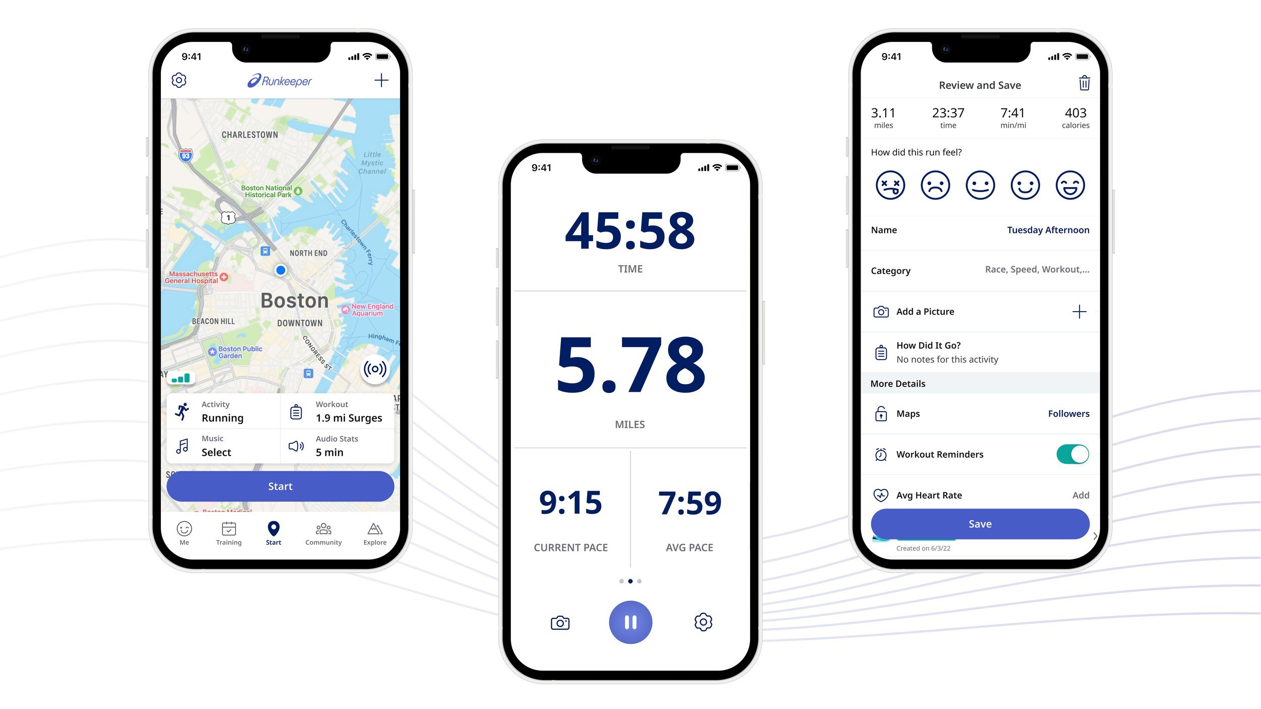
Rebranding the App
After receiving the brand guidelines, we started figuring out how to incorporate these changes into the product. Due to tech debt and time constraints, we opted to maintain the app's overall information architecture and only made adjustments to the colors, fonts, icons, photography, and illustrations. This ensured that our users could continue their usual experience without any disruption.
Accessibility is key
Kicking off our design process, we conducted an accessibility test with the new colors. Not all colors passed the test though.

Refining the color palette
After doing some research, exploring various options, and conducting color signal tests with users, we came to the decision of re-adjusting the palette hierarchy and incorporating additional tertiary colors. This strategic move was made with the purpose of enhancing accessibility.

Including additional tertiary colors for better accessibility
Intentional color application & usage
The original colors & design were competing for users’ focus. The new colors & design brought a balance of ASICS and Runkeeper in the same space.
Pre-rebrand (2022) vs. Rebrand (2023)
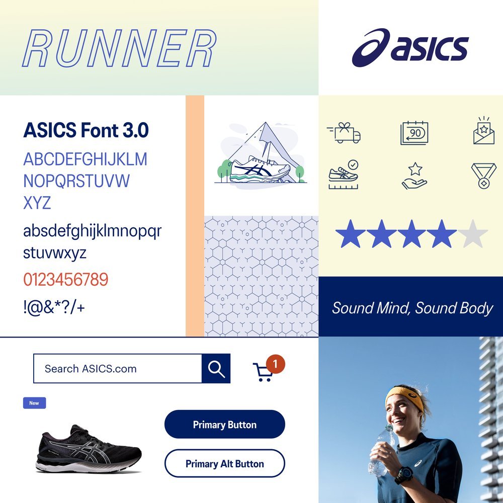
Finding a new font
After testing, we found that the proposed font, ASICS Font 3.0, had readability issues due to its narrow, condensed style, leading to a poor user experience. It also didn’t support the range of languages Runkeeper needed, so we had to explore other font options that were easier to read and supported more languages for our global users.
ASICS Font 3.0 has legibility issues in the app
We selected Noto Sans as the typeface for the mobile app due to its legibility, character spacing, compatibility with ASICS Font 3.0, and extensive language support. It ensures easy reading and enhances the design's visual appeal. This choice prioritizes user experience, brand consistency, and accessibility for a global audience.


Redesigning the icons
The Product Design team and I adjusted the icon style given by Bruce Mau Design to enhance accessibility and better match ASICS' iconography.
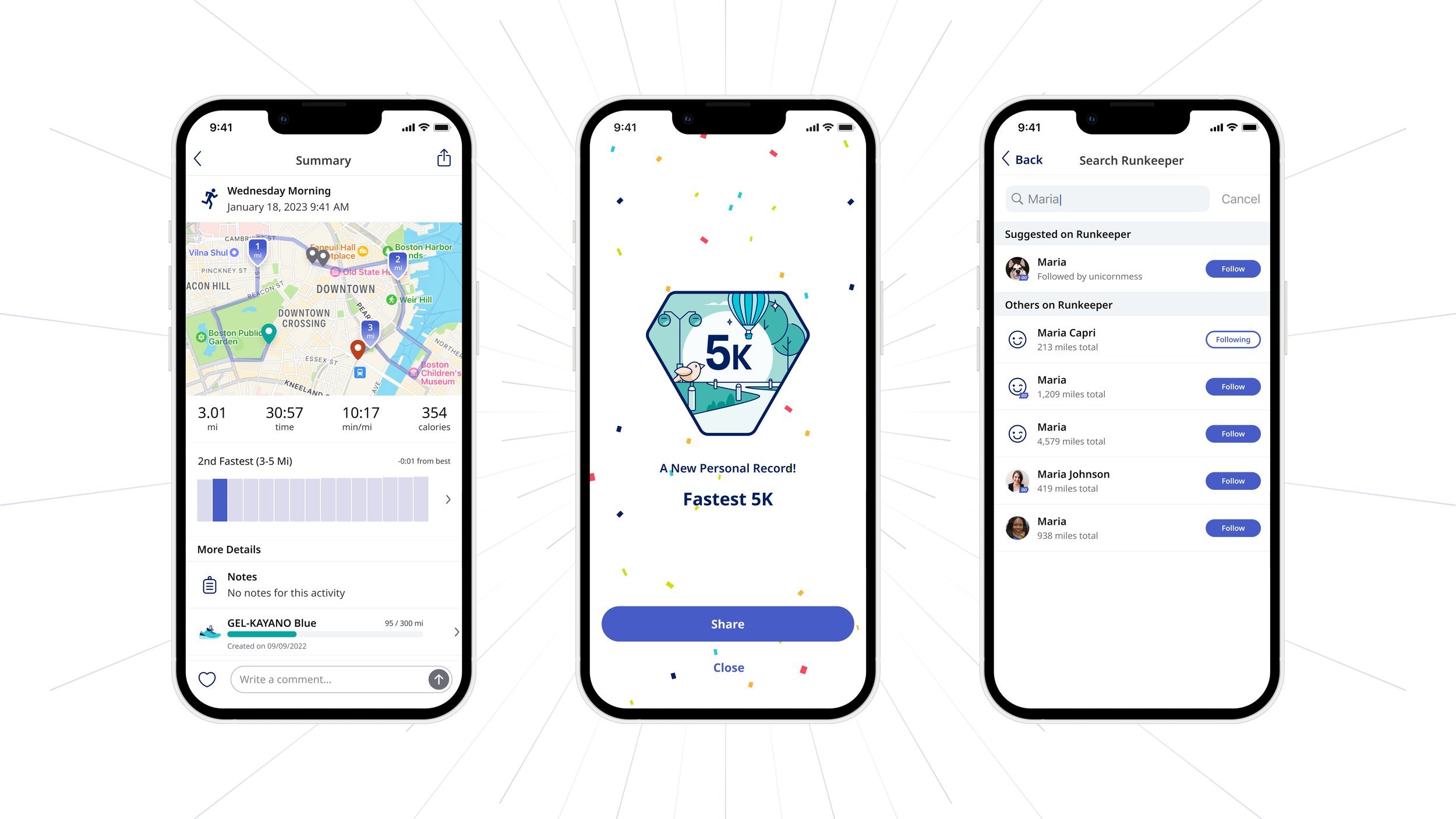
Visuals that make you want to “run”!
Thanks to James O’Connell for creating these badges and illustrations, which gives the users a fresh feeling of accomplishment.


Sounds easy to implement, right?
With an app as old as the App Store itself (fun fact: Runkeeper was one of the first fitness apps to release in 2008), you bet there was a design and code debt to clean up.
The Runkeeper Design System 2.0 is born ★
We quickly realized that to meet the rebrand launch deadline—and stay true to solid design practices—we needed a robust design system. Building and maintaining this system would make it much easier to roll out changes seamlessly across both iOS and Android.
Step 1: Update design system color palette & fonts
Step 2: Update design system components
A lot of the app’s UI components weren’t switched to Design System (DS) components yet, so we spent Q2 and Q3 of 2022 tackling as much of this work as possible. Once we made the switch, updating text and colors was a breeze, thanks to components referencing the right variables.
Even with all the DS updates, some color changes didn’t translate perfectly.
For any non-DS components, we handled updates manually, screen by screen.
Step 3: Update the “atoms” and “molecules”
Most screens required many steps to complete the DS work required to convert to the new system.
Runkeeper before…

and after ✧ ✴ ~
The Reactions

90.32% users said they felt the same or better about Runkeeper post-rebrand.
Change is not easy to accept, especially when you've been using an app for so many years. However, after carefully analyzing the data and observing the overall sentiments expressed on various social media platforms, we were pleasantly surprised to see that the majority of users were actually quite excited about the update and the fresh look it brought to the table.
Reflections
-
This project was truly a memorable experience for me. Our teams faced numerous challenges, including technical constraints, tight deadlines, and the need to balance everyone's input and feedback. However, the challenges gave me valuable lessons on how to lead multiple initiatives while maintaining effective communication.
-
Going into this rebrand, our team knew we needed a way to get around all the tech and design debt the app had accumulated over the years (without blowing scope out of the water). That’s how the Runkeeper Design System was born and it’s been a lifesaver for design and development ever since.
-
Making this rebrand work would not have been possible without everyone involved. Seriously. Every single person who had a hand in this deserves a gold star medal and standing ovation.